

Why Does Edge Banding Look Different from the Board Even When the Color Matches?
Jul 24, 2026
Leave a message
A customer once sent us a board sample and asked for a matching PVC edge banding.
The base color was very close, but when the two pieces were placed together, something still looked slightly different.
The problem was not really the color.
The board had a low-gloss textured surface, while the edge banding reflected more light. Viewed separately, both looked correct. Put together on a finished panel, the difference became obvious.
This is a common situation in furniture production. Matching edge banding is not simply a matter of finding the same brown, white, grey or beige.
Several details affect what the eye finally sees.
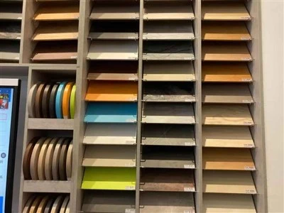
1. Gloss Can Change How We See the Same Color
Take two surfaces with almost the same color and place one under direct light. If one is matte and the other is glossy, they may appear to be two different shades.
This happens frequently with cabinet and wardrobe panels.
A matte board usually needs an edge banding with a similar surface appearance. If the edge reflects much more light than the face of the panel, it can create a visible line around the furniture even when the underlying color is close.
When checking a match, therefore, we don't recommend looking at color alone.
Gloss should be compared at the same time.
2. Wood Grain Makes Matching More Complicated
Solid colors are relatively straightforward. Wood grain is different.
Consider an oak design. The background may be light brown, but the printed grain can contain several darker and lighter tones. Another oak pattern may use almost the same base color but have much stronger grain contrast.
From a distance they may look similar.
After the edge banding is applied, however, the difference in grain can stand out.
When matching wood grain edge banding, we normally look at three things: the background color, the grain color and the strength of the pattern.
The goal is not necessarily to reproduce every line on the board. What matters is whether the edge looks natural when it becomes part of the finished furniture.
3. A Phone Photo Is Not a Reliable Final Color Reference
We receive many color inquiries through WhatsApp.
A customer takes a picture of a board and asks: "Do you have this color?"
Photos are helpful. We can use them to find several possible colors or understand what the customer is looking for.
But we would be careful about confirming an exact match from a phone photo.
A board photographed next to a window can look different from the same board photographed under warm indoor lighting. Camera processing changes colors again, and the customer's phone screen may display them differently from ours.
For a standard color where a small difference is acceptable, photos may be sufficient.
For a furniture project where the board and edge need to match closely, a physical sample is much safer.
4. Check the Edge Banding on the Actual Board
Holding a roll of PVC edge banding next to a board is useful, but it does not always show the final result.
The better test is simple: apply a short piece to the actual panel.
Once the edge banding has been glued and trimmed, you can see how it works with the board under normal viewing conditions.
This is particularly useful for:
dark wood grain panels;
high-gloss boards;
matte cabinet doors;
large visible furniture edges;
projects where the same color is used throughout a room.
A small trial can prevent a large amount of rework.
5. Thickness Can Affect the Final Appearance
Thickness is usually discussed in terms of durability and application, but it can also influence appearance.
With some light colors, especially white and beige, differences in material thickness and opacity may affect how the finished edge looks.
The profile of a thicker edge is also more visible after trimming and corner rounding.
This does not mean that thicker is always better. A 0.4 mm edge and a 2 mm edge are designed for different applications.
The important point is to evaluate color together with the actual specification that will be used in production.
6. Batch Consistency Matters for Large Projects
Imagine producing wardrobes for an entire apartment project.
The first batch of edge banding is used on half of the furniture. Several weeks later, another batch is used to complete the remaining units.
A small variation that would be difficult to notice on individual pieces may become visible when finished furniture is installed side by side.
For larger projects, it is therefore useful to estimate the required quantity carefully and, where practical, order enough material from the same production batch.
For repeat production, keeping the approved board and edge banding samples also gives the supplier a physical reference for future comparison.
What Should You Send to an Edge Banding Supplier?
If you need a close color match, the most useful reference is the actual board.
When sending a full panel is not practical, a smaller cut piece is normally enough. Decorative paper, an original edge banding sample or the board manufacturer's color reference can also help.
It is useful to provide the required thickness and width at the same time.
For example:
PVC edge banding / 0.8 × 22 mm / matte finish / match according to supplied board sample
This gives the supplier much more information than simply requesting "the same color."
A Good Match Is More Than a Color Number
Color matching sounds simple until the edge banding is actually installed on the furniture.
Base color matters, but so do gloss, texture, wood grain, opacity, lighting and production consistency.
For standard furniture, choosing the nearest existing color may be perfectly acceptable. For projects where the edge is highly visible or where appearance needs to remain consistent across a large number of panels, working from a physical sample is worth the extra time.
The easiest rule is also the most practical one:
Don't judge the match only from a screen. Check the actual materials together whenever possible.
Send Inquiry